00:00
00:00
DonkeysBazooka
I plan on animating stuff the rest of my life... sure hope I don't get my hands cut off.... that'd be rough

James Bowman @DonkeysBazooka

Animator... fo reelz

you bet

Los Angeles, CA

Joined on 3/30/06

Level:
29
Exp Points:
9,090 / 9,340
Exp Rank:
3,842
Vote Power:
7.07 votes
Rank:
Police Sergeant
Global Rank:
9,066
Blams:
515
Saves:
525
B/P Bonus:
12%
Whistle:
Silver
Trophies:
35
Medals:
289
Supporter:
11y
Gear:
7

Villainy Development Blog #4

Posted by DonkeysBazooka - January 20th, 2014


STARTING ANIMATION


1540586_139025085233_rough_city2.png


Hey… sorry I’ve been away for a while. I’ve got some great excuses ready to go, but if it’s all the same to you, I’d really prefer to just move on, and talk about this cartoon thing I’m doing…


So I said the next step was “animatic and beginning animation.” That’s a bit disingenuous, actually, because - much like voicework - the way I approach it is not an entirely straightforward process. I don’t go through and bang out an animatic for the entire cartoon, and there are a couple reasons for that. The first is that it would bore the shit out of me.  I’ll get back to that in a minute…


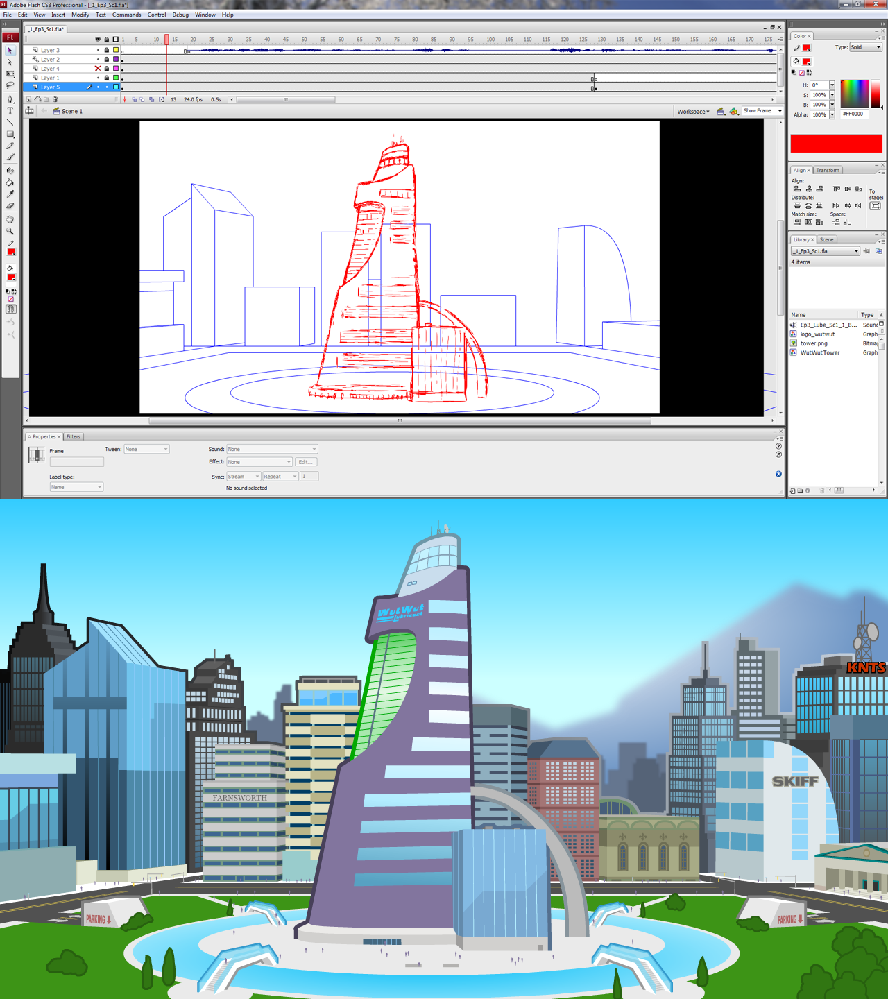
As you may or may not be aware, an animatic is the stepping stone between a storyboard and the animation. It is, in a sense, a storyboard with limited movement, and usually includes audio.  As you can see in the top image, there is an audio track on the timeline. That is the first line of dialogue recorded by the voice actor. Once that’s inserted into the timeline and I can hit “play,” I can really get a sense of how long that shot is actually going to be on screen.  In the storyboard, I envisioned the entire first line being spoken while the camera slowly zooms in on that building. Putting that into an animatic and having some image to go along with the audio allowed me to see that that would be too boring to look at for as long as the line is being spoken. Additionally, it made me realize, “Crap, that’s, like, identical to how Episode 2 started…”  So I’m going to switch it up. That’s no longer going to be the first shot.  I’ll still use it, but I’m going with a different approach.


I lay out shots and do rough animation in bright, vibrant colors (usually red or blue), so that I can easily distinguish between the “rough stuff” and what I want to keep when I’m polishing it up and doing the final version.  Somethings I’ll draw free-hand, but most background elements I just end up laying out with simple shapes and lines.  Then I just continually build upon them, adding more and more detail until it resembles what I originally envisioned.


I could have gone on and done rough versions for the next few shots in the animatic, but I didn’t feel like it. I wanted to finalize this opening shot first. So I did.


I HATE DRAWING BUILDINGS. This took fucking forever. I have completed exactly 1 background for the entire cartoon, and that is all I have done.  Go on, hate me for it.  I know I do.


Time Elapsed: 27 hours.   <——-(For one fucking background! Seriously!)


Previous: STORYBOARDING


Next: More stuff


Comments

Man that building looks so good and so fancy i don't really think that there is anyone willing to hate you for taking your time while drawing it.

So in short the animatic is the sketch of the animation.

Well make no mistake, IIIII hate myself for only being that far into the cartoon. thank you, though. And yes, the animatic is just the roughest possible form of the animation, mostly for timing and rhythm.

It looks really good so far. Seeing an actual update such as this, at least in my opinion, is better than a vague "It's coming soon", as it shows that you are actively working on the project, and reminds us what exactly you are working on. So make sure that you're happy with where this is going, we don't want you to hate this amazing series by forcing yourself to make them.

Ha, well I do hate how long it takes. I really do. But it's my own fault for being so focused on the tiny details. And in the end, if it makes me more proud of the product, it's worth it.

Your Villainy series has some of the highest production value out of every cartoon on this site so it's more than understandable why it takes you so long. I just can't wait to see the new episode. I wish you the best of luck trying to finish the episode and letting you know that you have a huge fan over here.

That means a hell of a lot, to me. Thanks, man :)

When do the other villians get introduced to the series

This episode I'm working on will introduce The Lube and Pherodoxy. That about does it for the main characters.

i love seeing "in process" screenshots like that! it's so cool, looks great too! buildings are a real challenge to not make boring, and you're awesome. l8r

thank you sir! I'll try to do as much "in process" stuff as possible.

This is a nice post to see. Getting the process explained is something I think we all missed during the upcoming movies/tv show episodes before the internet was so big. This kind of viewer/author interaction makes it a lot easier to be patient for the finished products and appreciate the authors.

I hope you can get some other people involved later on to help smooth the workload out a bit.
I've noticed a lot of movies on NG lately where there was credit specific to background artists.
Maybe you can get somebody to help ya out over at the BBS, unless you're all purist about it like I would be. Damn perfectionism. lol anyway, good luck!

Yeah, you get it. I'm just too particular about how I want it done, and consistency is very important to me. It'd be tough to find someone who could match the style precisely... especially one that would do it for free.

Your lines and actions are so fluid!! How do you get them like that? Mine always seem to be Jittery, then again I use the paint tool, Increasing the size of the canvas seems to smooth them out though, nothing near as smooth as your lines though. Any tips?

I do have advice for making your linework smoother. I think part of what makes my lines LOOK smoother is the thickness of the brush tool that I use. But if that doesn't suit your art style, and you want thinner lines I've still got advice:

Make sure your tablet has "pressure sensitivity." It's a setting you can turn on with the brush tool in Flash that makes your line very fine if you press the pen to the tablet lightly, and very thick if you press down hard.
The next thing is to set the brush smoothing to 40 or 50. 50 will, of course, make you line work smoother, but you have less control over the shape of the brushstroke. I have mine set to 40.
Lastly, after you draw a frame, or an image you're happy with. Select the drawing, and then use the smooth feature (Modify > Shape > Smooth). Only click it once per selection, or the Flash will completely warp your linework and make it look awful. You need to deselect it, and then reselect it if you want to make use that smooth feature to make it look even smoother. (It's strange, I don't know why it looks that way).

I may include something about this in one of the development blogs, going forward.

Hey dude, you still alive?

I imagine that life has got you by the balls or some such. Hope all is well on your end. Definitely hasn't been the same without your content.